JanBask Training Blog Audit
Client
JanBask Training
Service
Blog Writing
Industry
Content Writing
Year
Dec 2021
About Client
JanBask Training is an online education service provider offering courses in digital marketing to the sales force.
The Problem Statement
After reviewing JanBask Training's website, I learned about the courses it offers. Plus, the website also contains a lot of articles with decent views on most of them.
However, after reviewing a couple of them, I could find some glaring issues. These are some of my observations:
An introduction must be between 130 and 180 words with relevant facts. In most of the blogs, the introduction was more than 200 words. This harms the experience in both desktop and, especially, mobile mode. Please refer to this link as an example – https://www.janbasktraining.com/blog/salesforce-interview-questions/
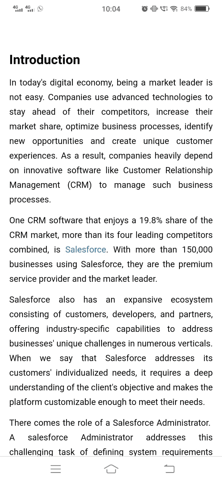
Also, the introduction lacked why a user must read this blog, how it is going to help them, and what they are going to gain from the blog.
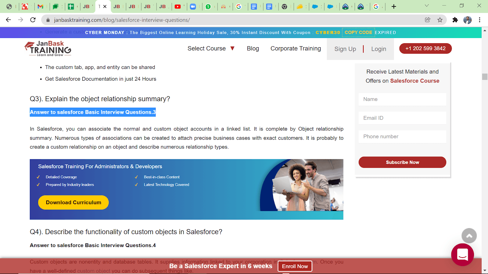
In the same blog, the line “Answer to Salesforce Basic Interview Questions. 3” is unnecessary; it follows the question. Also, almost the same line is written after every question everywhere, which looks like a repetition.
The blog paragraphs could be shorter. This was an issue found in most blogs. Also, the tone was very mechanical. It's not friendly and conversational.
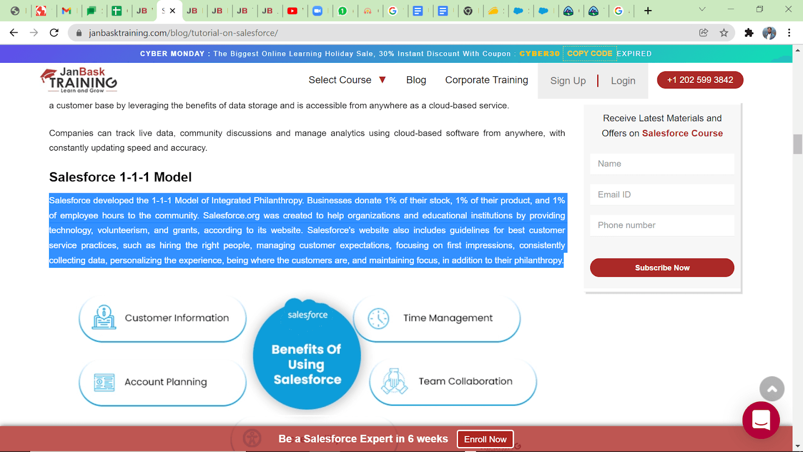
The highlighted paragraph above can be broken into two paragraphs. Also, lines like “What is the Salesforce 1-1-1 model? Let me guide you.” This could be more engaging.
Also, having a call to action – “With no delay, join the tutorial on Salesforce, get certified by pursuing a professional online certification course, and jumpstart your Salesforce career!" – in the introduction may not be right.
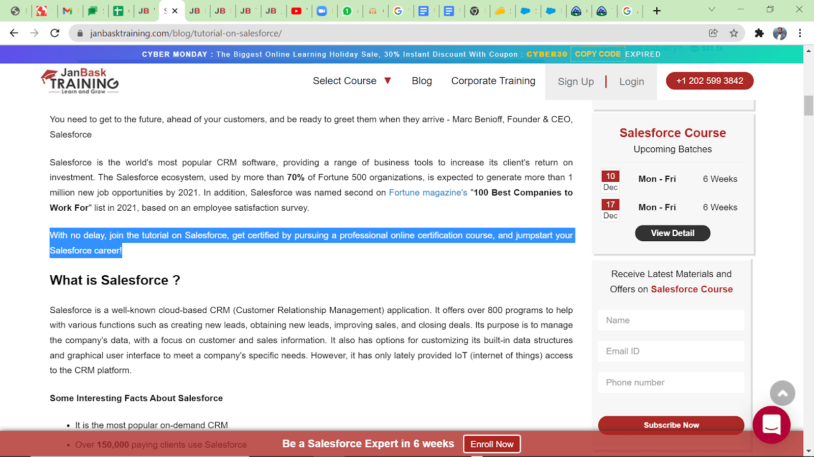
The article is about the Salesforce Guide, so as an audience, I would like to know about Salesforce first. It will be appropriate if we can insert this line between and at the end.
Another major flaw in the blogs was the lack of any connecting lines between paragraphs. In longer blogs, these lines keep the users hooked from start to end.
Now, in this Salesforce guide, under the section "Salesforce Tutorial For Beginners & Experienced", we can mention, “Before knowing about how to become a Salesforce professional, let’s know about its functions and benefits first." This could have prepared the reader for the next set of information.
Such lines engage the readers, connecting the two sections or paragraphs. Nowadays, everyone has a mobile in their hand. On mobile devices, often the entire page does not appear. So, small paragraphs and connectors can help readers navigate through the content.
Another thing I observed in another blog, "Docker Certification", is that the FAQ section was placed suddenly before the conclusion. They are normally placed after concluding.
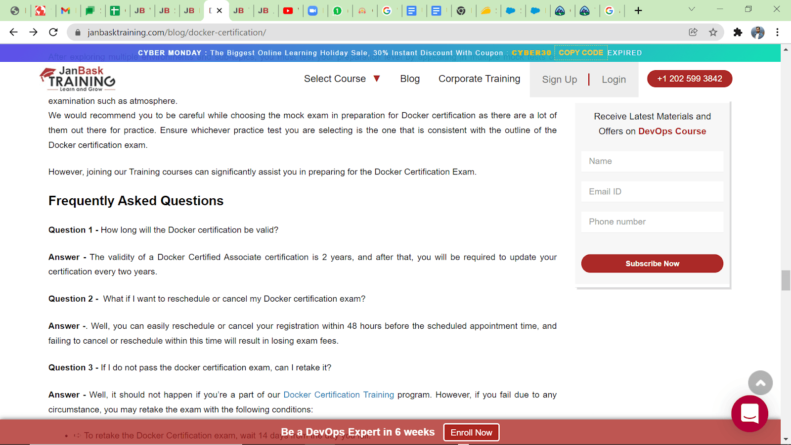
Link - https://www.janbasktraining.com/blog/docker-certification/
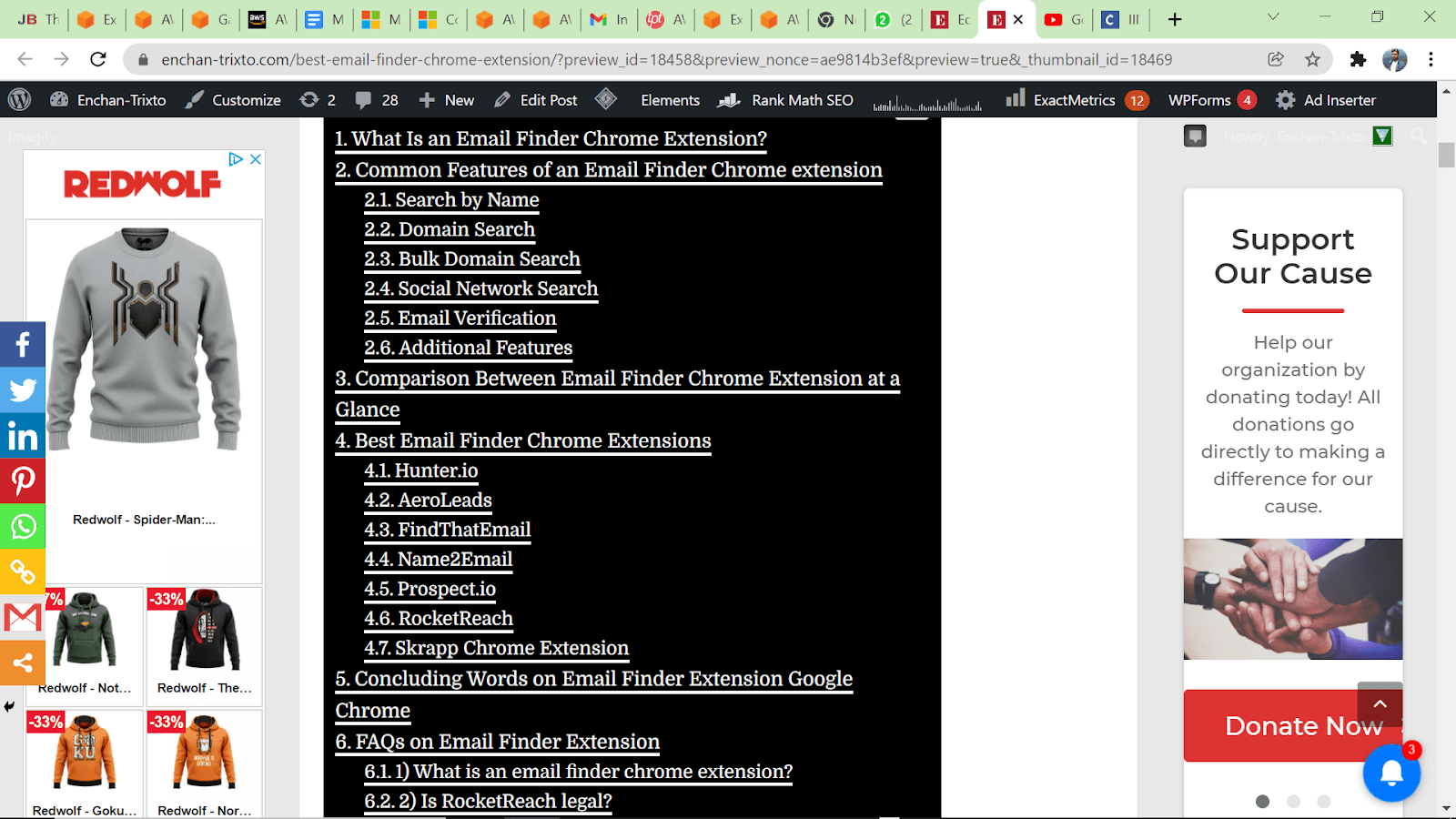
This TOC (Table of Contents) in that blog didn't show the sub-sections clearly, as mentioned in the blog shown below. This clearly defined the H1, H2s, H3s, subsections, etc.
The TOC is not there in the mobile version for these blogs. Link – https://www.janbasktraining.com/blog/salesforce-admin-tutorial/; Link – https://www.janbasktraining.com/blog/what-is-sfdc/
Also, the YouTube videos were getting trimmed to half in some blogs and didn't fit within the margin.
Deliverables
I passed on my above observations to the team to help them create better and more well-structured blogs across JanBask. The content is good; however, the presentability, like introduction, tone, smaller sentences, smaller paragraphs, and paragraph connectors, could be much better.